


1
2
3
4
5
6
7
2012
Objective
Work with assigned typeface and to create a black and white double sided poster. One side is the fun, graphic side while the other is a type specimen.
Concept
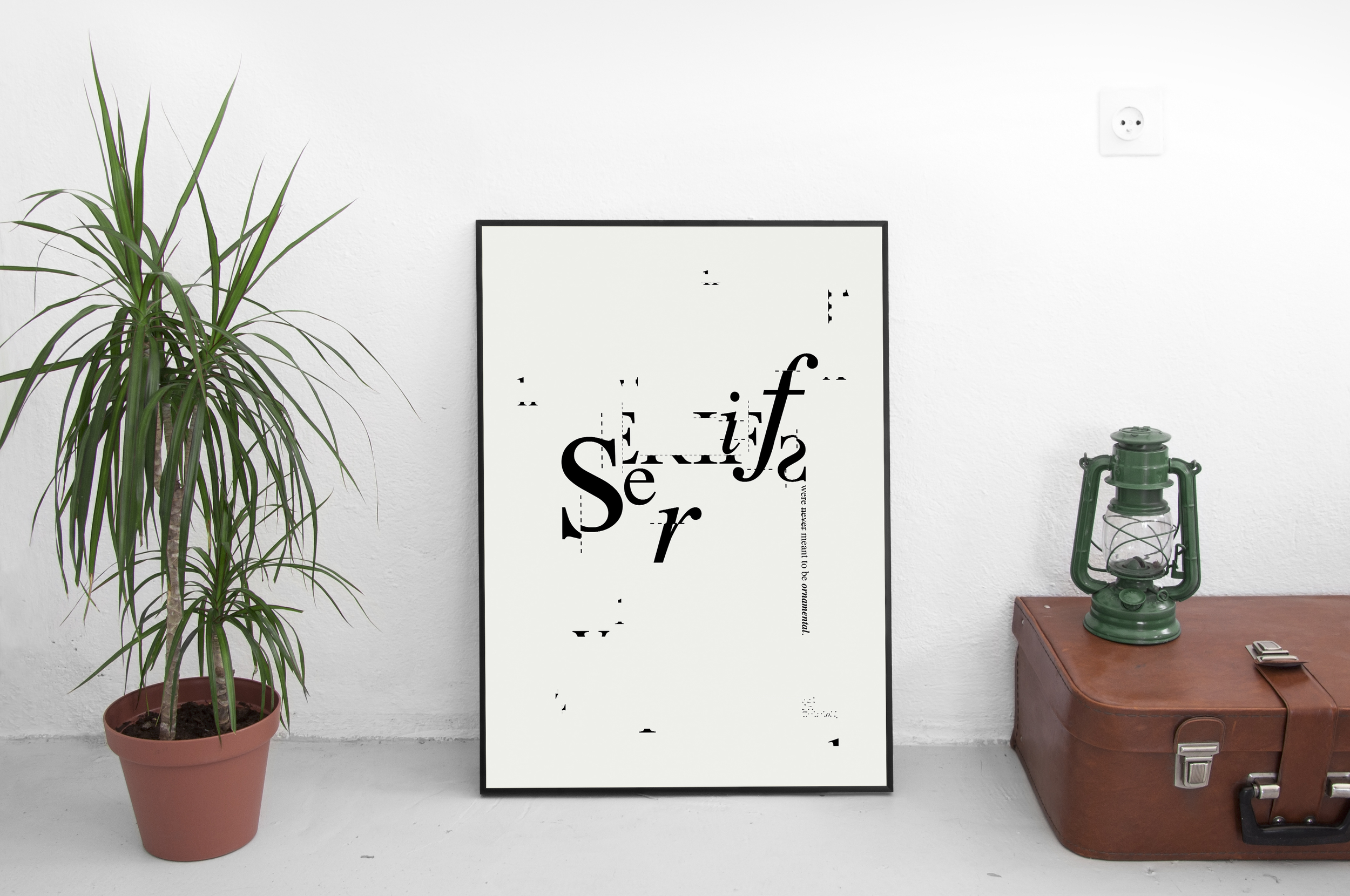
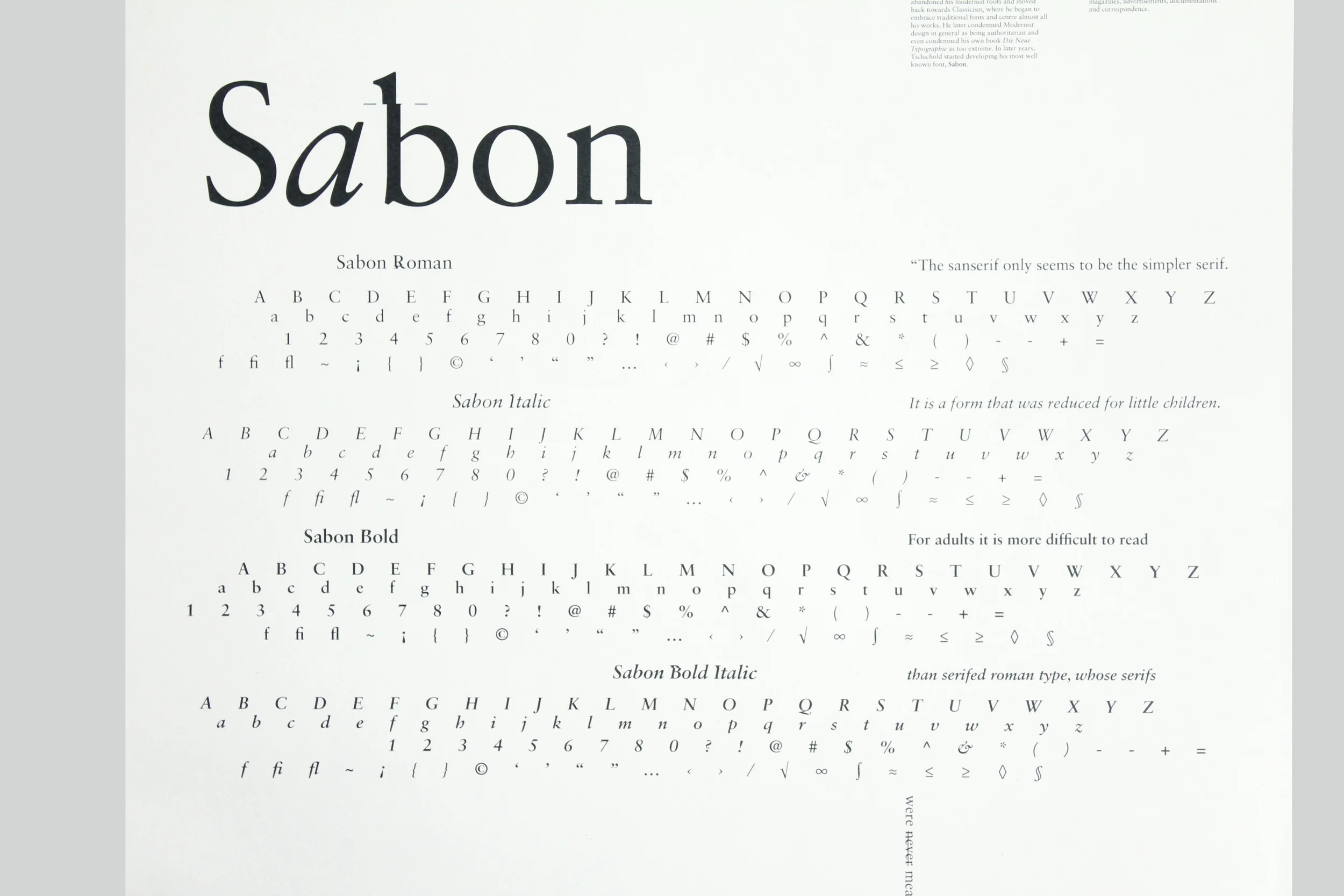
The concept behind this poster was inspired by the life of Jan Tschihold (1902-1974), a German typographer who designed his best well known font, Sabon. In Tschihold's early works, he was hugely influenced by modern avant-garde artists. However, he abandoned his modernist roots and moved back towards Classicism after being accused for creating "un-German" typography by the Nazis.
I designed this poster based on one of Tschihold's quote:
The sanserif only seems to be the simpler serif. It is a form that is reduced for little children. For adults it is more difficult to read than serifed roman type, whose serifs were never meant to be ornamental.
I came up with the idea of emphasising on the serifs of the letters by adding dotted lines, as if they were being cut.
Design | Carol Chan
Photography | Carol Chan
Category | Print